On the first picture (at the bottom) there has been no editing. This is the original picture.
On the middle picture i have started using photoshop to improve Robs image. I have airbrushed out his spots and also used the healing brush to make his neck look smoother by erasing out his hairs. However, as i used the magic eraser tool to crop out his main outline, it did leave some grey making the ends of his hair and round his jacket look wrong.
On the top picture Rob has been fully edited. I have gone round his outline to get rid of the grey that the magic eraser left. By using the eye dropper tool i could get the exact colour of my faded background to then go round Robs outline.
Friday 29 January 2010


Thursday 28 January 2010
Peer Feedback Evaluation
For potential problems a couple of people mentioned lighting. I will tackle this by using various props like lamps and the headlights of a car to create the right lighting and mood that i want my picture to portray. Also, i will find a picture to match my magazine by dressing my model in the clothing that would appeal to my target audience. The rest of the possible problems were said by a minority.
I'm pleased that so many people liked my colour scheme, nearlly 50%. I feel my scheme is unique so I'm glad that the rest of the group felt like its a positive for my magazine. Also, some people like the unique indie style of my magazine, this is good as i didnt want to change this unles i got a lot of negative feedback about it.
As for advice, nobody really commented about anything inparticular that i feel i need to consider. Im pleased with this as i've spent a lot of time thinking through all aspects of my magazine so now i feel like its paid off as ive got the support of my group.
Peer Feedback
Possible potential problems:
*Lighting to create effects on my models (3/17)
*The blue against the white/grey colour scheme (1/17)
*Finding the right picture to match my magazine (3/17)
*Could be heavily influenced by other magazines (2/17)
*No answer (8/17)
Positive comments:
*Unique (5/17)
*Indie style (4/17)
*Colour scheme (8/17)
*Good name of magazine (3/17)
Advice:
*Play around with lighting (2/17)
*Keep to using 3 colours (1/17)
*Target niche audience (1/17)
*No answer (13/17)
Tuesday 26 January 2010
To-Do List...
* Upload peer feedback from my magazine pitch
* Take contents picture
* Complete mock ups
* Finish editing pictures
* Take contents picture
* Complete mock ups
* Finish editing pictures
Backgrounds Analysis
I really like the first background choice as it ties in with my colour scheme. I feel like it looks as if the light has hit from Rob from the top left corner and therefore looks really effective. Also, he is looking to the left so it looks like hes looking towards the light.
The blue background is nice, yet i dont think its very Indie. I feel it looks a bit tacky as the blue is quite harsh and doesnt blend into a very nice gradient - i dont think ill use this one.
I also like the grey one. As i feel grey is a nice neutral colour and therefore will work well with whatever font colours i decide to use on top. I'm going to try both backgrounds with the picture of Rob and then decide from there which one I will use for my final piece.


Unedited Picture Possibilities
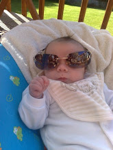
The 1st picture is the one i want to use for my front cover. I like the picture as Rob looks really casual and looks Indie with the way hes styled and his hair and sunglasses. Also, it is a mid shot - so it's at a nice distance and leaves me lots of room round the outside to do the rest of my front cover.
Im going to use one of the pictures of Rob infront of the graffiti wall as my double page spread, with the words surrounding him on the brick wall. As i wanted the picture at night time i needed a source of light, so i actually used my sisters car with her headlights on full beam to create the lighting on the pictures.
For the double page spread I'm going to use 2 little pictures in the corner below the graffiti picture. One of these will be of Rob and the dog and the other will be of Rob and his girlfriend Hayley.
For my contents page im going to have a picture of Hayley lying on the floor with Rob standing above her. Then i can have the contents surrounding them down the left and right sides. I'm yet to take these pictures.


Friday 22 January 2010
Draft Article
I have decided to use an interview for my double page spread. I've done an opening paragraph and a closing few lines on either end of the interview. However, the mock article is really long, so i'm going to need to shorten it and take out some questions/responses so it fits nicely around the picture im using on my double page spread.
Inspiration
I have chosen the close up picture of the bottom model as inspiration as the way hes styled his hair and wearing a scarf and his overall presence is how im going to have my front cover. Also, i have chosen the picture of the model surrounded by scenery as for my double page spread i want a picture of my model surrounded by forrest and trees and scenery. Both of these models i found on the Models 1 website and i browsed through many of the models portfolios to decide on some key ideas for my work.


Tuesday 19 January 2010
Models
I have decided to use my sister and her boyfriend as my models for my magazine. I have chosen Rob to be the main model as i feel he has a good Indie look about him as he has the stereotypical long hair and facial hair. I will include Hayley on the contents page as I'm using inspiration from my magazine research (the contents page of Ciara in Vibe magazine) to incorportate Hayley and Rob in one picture. My front cover I'm going to have a mid-shot of Rob against a plain background - possibly wearing sunglasses. For my contents I'm going to have a picture of Hayley on the floor posing with Rob standing behind her. For my double page spread I'm hoping for a scenic shot of Rob in the woods surrounded by trees.


Colour Scheme
I have decided to chose a blue, grey and white colour scheme. This is because i feel its original and i havent saw anyone use it before for a magazine - so this should make my magazine more interesting and unique. Lots of people in my class are also using black and white, so i thought i would stay clear of that. I feel like the colours would appeal to both male and females as the blue ive chose isnt that dark, so shouldnt put females off reading the magazine. So far for my front cover I'm planning to have a grey background, with a blue title and then all my little bits of writing in white and blue.

Friday 8 January 2010
Moodboard Explained
The people at the top of my moodboard are what would be a stereotypical image of an 'indie' person. The top left and the top middle are 2 bands that do Indie music and the person on the left is Noel Fielding - out the program The Mighty Boosh - a programme that Indie people would probably enjoy. All the clothing on the moodboard are from websites such as All Saints, Cult and Topshop/Topman. These shops produce clothing such as skinny jeans, converse, chequered shirts, hats, ties and vintage looking items - all which someone whose interested in Indie would also purchase and dress in. Clothing like this is very different and statement, people where them to stand out and look individual. The majority of the clothing is however mens, yet women also wear Indie clothing and enjoy Indie music - a good example of an Indie woman would be Alexa Chung, TV presenter and fashionista. The reason i have put 1980's on there is because that was the era when Indie music really came out and entered the music scene, artists were becoming more individual and experimenting with this new genre of music. This ties into the word 'America' on my moodboard, which is there as America started the genre off, but then was copied in the British industry and has even ended up becoming more famous and popular with more followers over here than over there. There are plenty of Indie bands which are now on the music scene and becoming very popular such as the Kaiser Cheifs (top left), The Horros (top middle) and Kasabien. All these items on my moodboard have inspired my idea for my magazine and the models in my magazine will be dressed in similar items of clothing - as i enjoy this type of music i feel it will make my magazine more effective as i know a lot about the genre and am interested in the type of individual clothing Indie people where.

Tuesday 5 January 2010
Subscribe to:
Posts (Atom)