Thursday 25 March 2010
Fonts
I have decided to use Maiandra GD as my main font as it is nice, simple and easy to read. It suits my genre and looks good on all 3 of my pages.
Background for Contents

I decided to use this grey picture as my background colour for my contents. I adjusted the contrast and the brightness to make it lighter. I like the grainy effect as its more interesting than just a plain grey as the background which i had before.
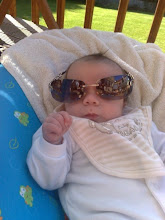
New Models


My Contents page also needed more pictures. So as i already had one of a boy and a girl, i decided to go for one picture of a boy and a picture of two girls. This would therefore make my magazine appeal to both males and females. The top picture is the bestfriend of my original model, so i got him to pose when i saw him out in a nightclub because his outfit was Indie and the red lights in the background looked cool. I took the picture of my two friends at a birthday meal we went two, they had both done their hair and makeup nice and they looked quite similar so thought i could pass them off as sisters for my magazine.
Last Minute Contents Changes


After looking properly at my contents page, i was really unhappy. The fonts were much too boring so i went onto www.dafont.com to find a more original font.
Tuesday 23 March 2010
Changing My Ideas
Between my mock - ups and now i have decided to change a lot.
On my front cover i have changed the font IND:E is in - i feel the font on my mock up was too informal, so decided to go for something for casual and bold.
I also decided to double it up, by overlapping the layers, just to make it look a bit more querky.
Another change is the blocks at the top and the bottom. This makes the front cover look neater and seperates the title and the bands at the bottom from the main picture.
For my contents i have changed almost everything. I've kept things minimlastic and added space for 2 more pictures for entertainment.
I have cut the picture of Hayley and Rob out and adjusted the brightness and contrast to make them look more tanned and flawless.


Friday 5 March 2010
Thursday 4 March 2010
AFL
Peer Assessment By Katie & Kam
framing a shot, including and excluding elements as appropriate - level 3 - good style and looks professional
using a variety of shot distances as appropriate - level 3/4- good variety of shots which suit the pages
shooting material appropriate to the task set- level 3 - props go well and Rob looks suitable for target audience
selecting mise-en-scene including colour, figure, lighting, objects and setting - level 3 - outfits are good and tie into the genre, lighting on all pictures is suitable and thought out
manipulating photographs as appropriate to the context for presentation, including cropping and resizing - level 4 - good cutting out, very precise.
accurately using language and register- level 4 - no spelling errors etc on draft article or front cover
appropriately integrating illustration and text- level 3 - everything is relevant and not overcrowded
showing undestanding of conventions of layout and page design - level 3/4 - good layout with everything spaced out
showing awareness of the need for variety in fonts and text size - level 3 - variety of fonts and colours, maybe use a different shade of blue.
using ICT appropriately for the task set - level 4 - good use of photoshop to manipulate each page.
Other Comments - Contents is looking a bit plain but with a proper background done it should tie into the other pages.
Monday 1 March 2010
AFL
Self Assessment -
framing a shot, including and excluding elements as appropriate - level 3 - as i feel my pictures are suitable with suitable props etc.
using a variety of shot distances as appropriate - level 3 - ive used a different distance for each shot, using a mid-closeup on the front cover which is conventional on a magazine, a full length shot for my contents and a further distance shot for my double page spread so it would fill more of the page.
shooting material appropriate to the task set- level 4 - my pictures fit the genre and appeal to the target audience.
selecting mise-en-scene including colour, figure, lighting, objects and setting - level 4 - for my DPS I used my sisters car headlights to create a night time effect yet still being able to see Rob clearlly and used a variety of settings for my photos.
manipulating photographs as appropriate to the context for presentation, including cropping and resizing - level 4 - i spent a lot of my time cutting out my contents and front cover picture so that i could move the models onto different backgrounds but making it look like they are naturally there.
accurately using language and register- level 4 - i have made no spelling errors and have used a medium register to appeal to my target audience.
appropriately integrating illustration and text- level 3 - ive aimed to fit my text appropriately around my pictures as not to overcrowd the pages
showing undestanding of conventions of layout and page design - level 3 - ive used conventions like a big mast head and large headings, i feel like my end product will look professional.
showing awareness of the need for variety in fonts and text size - level 3 - i need to integrate a different font into my work for more variety but i like my colour scheme and feel the sizes of my fonts are right for each page.
using ICT appropriately for the task set - feel i've used photoshop well to manipulate my images to get the effect i wanted.
Subscribe to:
Posts (Atom)